We create relationships that last, and like any good relationship, we always push ourselves to offer the most consistent communication, honesty, and trust. Because we’re so focused on partnerships over revenue, we don’t worry about billable hours, we work on results. The only thing that matters to us is realizing your vision online and we’ll stop at nothing to help get you there. We deliver what we say we will, on time, and it will always blow you (and more importantly) your customers away.
3,000%
Average Increase in Click Through Rate
100%
Average Increase in Lead Generation
500%
Increase in CTR and Conversions
50+
Web Partnerships Built
What makes us different?
Expertise
There’s a lot of web design agencies that offer just that; design and development. But web design isn’t just about an aesthetic site, it’s about developing an experience for your customers that converts web traffic into sales.
Goals
We start with your website goals and work backward to the strategies it’s going to take to achieve them. A good web design company will think of your target audiences, and build creative design and copy to reach them.
Customers First
Design is only half of the equation to a beautiful site. We also take user experience, marketing messages, funnels, and conversion rates into consideration so we can build a web page that’s beautiful and converts leads into sales.
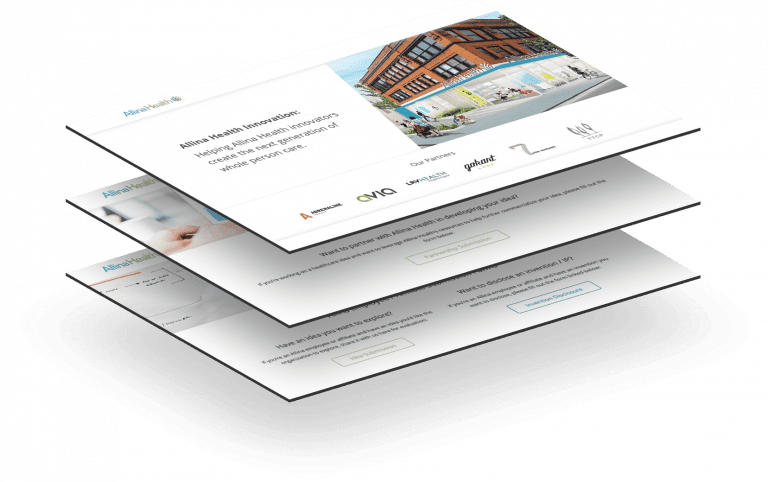
Web Design Case Study: Allina Health Innovation Site
Working with companies the size of Allina Health can pose a unique challenge in navigating the complexities of their brand voice, tone, and visual elements. We sought out to synergistically combine the visual and cultural identity of Allina, and draw out a more minimalistic look and feel whilst keeping accessibility and experience in mind.
After we’ve chosen the SEO package that works best for your organization, we’ll set some clear goals. We’ll want to do a deep dive into Google Analytics and the metrics that matter to your business, and always keep our eyes on those metrics throughout the campaign. Are you a service-based company looking for the phone to ring? Or are you an eCommerce business looking to drive traffic through your funnel? Whatever your goals are, we’ve got everything you’ll need to achieve higher search engine rankings to meet them.
Customer Persona’s
After we’ve discussed your objectives let’s dive into your target audience and what they care about. We’ll help you create customer persona’s that match that audience so we’re extremely clear about who we’re targeting.
Core Messaging
What’s your UVP? Let’s make sure that shines through in your web copy. We’ll want to ensure that your customers have a clear understanding on why you’re a better choice than the competition.
Design
Once we know exactly who you’re targeting we’ll get to the fun part; design. We specialize in unique experiences and make sure that’s exactly what your customers get; a unique experience.
Launch & Measure
This one of the most crucial parts to any site build; measuring the results. We’ll make sure that all that time and effort didn’t go to waste by helping you measure and analyze the impact.
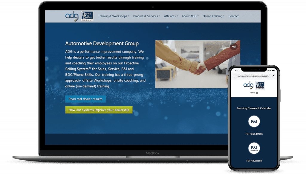
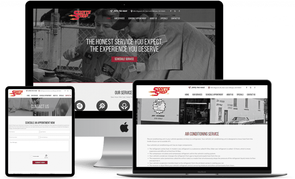
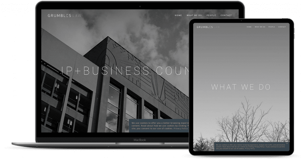
Other Awesome Web Builds
Automotive Development Group
“AJ and his team crafted a beautiful new website for ADG and have been irreplaceable as our web management team. I would highly recommend anyone to The Guerrilla Agency for web and marketing work. Incredible team.”
Grant Torgerson – Marketing Coordinator
Scott’s Shop
“The Guerrilla Agency has been an integral part to our website strategy and development of our website. We couldn’t be happier with the quality of work and communication from the Guerrilla team.”
Scott Hayes – President
Grumbles Law
“I’ve known AJ, the owner, long time and I’ve had the privilege of watching The Guerrilla Agency grow into a firm that can deliver on all their lofty promises. If you’re looking for web and SEO help, look no further.”
Ernest Grumbles – President
Conversion Rate Optimization
Once your sales and marketing engine consistently attracts website visitors and at progressively high amounts you should start thinking about CRO to convert those visitors into leads for your sales team. Businesses typically have a finite demand for products and services, so it’s imperative that you make the most out of your existing website traffic.
Unfortunately, there isn’t a reliable way to price your website without having a thorough understanding of the number of pages, design complexity and functionality. Our pricing model starts at $15,000.
Yes. If you’d like your website to be found by your customers organically, we can strategize your landing pages and write the content using best SEO practices.
All the websites we build are custom and the turnaround time depends entirely on your team’s ability to sign off on the work we present. Normally, our sites take anywhere from 4 – 6 weeks.
Send Us a Message
Reveal Product PricingPlease, fill out the contact information below so we can give you an accurate price quote.